
Tips and Training
Cal Poly is committed to the idea that accessibility is part of everyone's workflow. Writing, designing, and communicating with accessibility in mind is the first step. Develop your skills with the links below or sign up for training.
The accessibility of digital content should be evaluated by performing both software-assisted and manual checks to identify issues. Think about accessibility during your content's creation and test whenever you add additional content or features. If possible, test your content with screen reader software.
You should frequently assess the accessibility of your digital content, such as a single document or web page, a web site, or an entire domain. A thorough process includes both the use of automated tools and manual assessments.
Faculty can find more in depth information about instructional materials training at the Center for Teaching and Learning.
Quick Tips
Below are some quick tips to raise your accessibility knowledge, namely in the area of digitally accessible websites and documents.
Tip #1: Use Meaningful Link Text
The label or text of the link should accurately describe the purpose of the link and the destination web page or content. Descriptive link text helps users feel confident about where links will take them.
Most assistive technology software (e.g., screen reader) provides users with a list of all the links in a document, no matter the users’ current position in the document. The feature also describes all links without their original context.
Consider these guidelines when writing link text:
- Avoid link text like “Click Here,” “More,” and “Read More.” These can be confusing when a screen reader reads them out of context.
- Use unique link text where possible. Speech recognition software users may have a bad experience with duplicated link text.
- Avoid using a long URL (e.g., http://policies.calpoly.edu/policies/categories/administration-operations/equal-opportunity/ADA-policy.html)
- Use judgment when linking full URLs. When linking a URL, consider users who must speak it out loud and who must listen to a screen reader announce it.
- As a test, read your link out loud. Does it make sense? If not, rearrange the sentence to convey a clearer meaning.
For example: "For more information, visit the Cal Poly page on the coronavirus” will sound clearer and more useful to users of assistive technology than “for more information on Cal Poly and the coronavirus, click here.”
Finally, while you are thinking about links, make sure your links are not broken. The Drupal link checker should be used often.
Since 1999, it has been a firm web-usability guideline to refrain from opening new browser windows for several reasons. Read more about where your links should open.
UX Collective article about the problem of Click Here and Learn More links.
Excellent overview about designing links for websites and emails
Tip #2: Add Alt Text for Images
Using image descriptions (alt text) is essential for accessibility. Images often convey valuable information. Alt text should be clearly written and give an accurate description of the image.
Screen readers read image descriptions out loud. This means that blind and visually impaired people can understand the content of the image in an accessible way. If images do not have alt text, then screen readers will simply say “image” or “graphic” which gives no context or meaning.
- Be specific and succinct. The alt text should describe the purpose of the image in the fewest possible words, ideally fewer than 15.
- Describe information, not aesthetics.
- Don’t start with “a photo of” or “an image of”. People who use screen readers every day will be aware that they have reached an image because of the semantics of the img element.
- Think about the function of the image.
- As a test, ask yourself, "What information am I trying to add with this image?"
For example, consider the description for the image below.
“Logo for ADA30 Americans with Disabilities Act (1990-2020) – Celebrate the ADA! – July 26, 2020.”

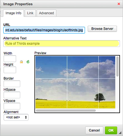
When placing the image from Drupal make sure you set a simple yet descriptive alt tag. (Yellow box in image below or the second input.)
Tip #3: Use Headings Correctly
In 2017, WebAIM asked how screen reader users preferred to find information on lengthy web pages. Almost 70% of respondents said they preferred to use headings on a page. Clearly, organizing pages using headings is one of the best accessibility strategies available.
Think of headings as an outline of your webpage. They provide a solid structure to the webpage for both sighted users and screen reader users.
Breaking up content with headings allows the page to be easily scanned by the user visually or with a screen reader. Visually, headings are presented as larger and more distinct than surrounding text. Making texts larger helps guide the eye around the page. Using headings and making them visually apparent is especially helpful for users with cognitive disabilities.
Screen reader users can navigate a page according to its headings, listen to a list of all headings, and skip to a desired heading to begin reading at that point. Screen reader users can use headings to skip the repeated blocks of content like headers, menus, and sidebars, for example.
- Use headings to introduce content; they are labels not statements.
- Select the appropriate heading level based on its hierarchy ranking, not its appearance.
- Do not use bold instead of a heading. One of the most common accessibility mistakes is making text bold when a heading is needed. Though the text may look like a heading, the underlying code is not set correctly.
- Use styles to highlight or emphasize text that is not a heading to achieve visual results. Headings are not for visual styling text.
Benefits
These measures allow the users of assistive technologies to:
- detect the sections (or subjects) covered on the page
- understand different sections of related content
- navigate quickly to any specific section
- allow search engines to detect the page’s main topics
Below is an illustration that shows what the underlying structure looks like.
-
Heading 1 is usually the name of your page
-
Heading 2 are usually the main topics (H2)
-
Heading 3 (h3) are usually the sub-topics of Heading 2
-
-
Heading 2
-
Heading 3
-
Heading 3
-
Heading 4 (h4)
-
Heading 4
-
-
-
Below are examples for proper use of Headings.
Proper Use Example Sample (H1)
Favorite Meals (h2)
Maintaining proper order helps make the page make visual and structural sense.
Ready Made (h3)
- This is a list
- Use the list functionality in Drupal
- A link in a list is ok.
- Banana
- Carrot
- Cheeses
Quick and Easy (h3)
Next example related to the H2. Paragraph text.
Pizza (h4)
Idea related to the h3. Paragraph text.
Burgers (h4)
Another Idea related to the h3 above, "Quick and Easy."
Some Assembly Required (h3)
New idea related to the H2, "Favorite Meals."
Lasagna (h4)
Vegetarian or Classic style (beef) take more time to make. Relates to h3 above, "Some Assembly Required."
Improper Use Example Sample (H1)
Favorite Meals (h4-wrong heading level)
Using a heading markup to bold a paragraph is incorrect usage. Incorrect order causes visual and structural confusion.(h3)
Ready Made (h2)
-
This is a list. (h4)
-
Do Not use headings to style the list (h4)
- Use Bold/Strong instead if you need to
-
Do not use headings instead of a list (h4) as below
Banana (h4 incorrect usage as a list)
Carrot (h3)
Cheeses (h4)
Quick and Easy (h4)
Wrong heading level above. It should be a subset of "Favorite Meals."
Pizza (h3 incorrect level now)
Headings are now out of order.
Burgers (h4)
Hard to figure out what is heading is related too. Is it "Ready Made" or "Quick and Easy" or "Pizza?"
Some Assembly Required (h1)
Another new idea that should be related to the "Favorite Meals" but is set as Heading 1.
Lasagna (h4)
Vegetarian or Classic style (beef) take more time to make. This heading should relate to heading directly above.
Tip #4: Using Color and Color Contrast
Color is often overlooked as an accessibility concern. Colorblindness is the inability to differentiate between certain colors, getting colors mixed up, or not seeing colors clearly. Relying on color alone to convey information and improve readability makes it difficult for a colorblind person to use your website. The visual presentation of text and images of text should have a contrast ratio of at least 4.5:1.
- Test your color choices with a color contrast checker.
- Test your color choices in monochrome.
- Do not use color alone to provide information.
- Never use yellow type on a white background.
- Always test color in infographics and maps.
Examples

Text
Color contrast is addressed under WCAG guideline 1.4, specifically in success criterion 1.4.3, which states that “The visual presentation of text and images of text has a contrast ratio of at least 4.5:1.” However, there are a few exceptions to this rule:
- Large Text: Since enlarged text is easier to read when used with a lower color contrast ratio, large text and medium bold text can satisfy the guidelines if there is a contrast ratio of at least 3:1.
- Medium bold text: At least 14pt font, but must also be bold (font-weight of at least 700).
- Large text: At least 18pt font.
There are a multitude of online resources, such as the WebAIM Color Contrast Checker, to test for color contrast ratios by entering hex color codes or RGB values. Remember to take into account the font size of your content to determine if the contrast ratio needs to be 3:1 or 4.5:1. If the contrast pair that you are testing does not have a sufficient contrast ratio for the text size used, the easiest solution is to darken (or lighten if two dark colors are used) one of the colors until a sufficient contrast ratio is met.
Graphic Examples
It is really import to look at your graphics for color problems before publishing. The maps below show a color map on the left and how a person with Deuteranopia (green deficiency) would see the map.
Color Choice

Possible Problems

Color is often used to signify different segments of a graph. Texture should be used in addition to color to distinguish between objects, like in graphs or charts. The image below demonstrates how people with different vision would see this. Using texture can help make the graphic more color-blind-friendly.

Images with Text
Text overlaid on imagery is tricky because some or all of the image may not have sufficient contrast in relation to the text. The other problem with using images and text is screen readers cannot read the text in the image.


The color of the font needs to have sufficient contrast with every color in the background that the font is touching to be fully legible for everyone. Instead of trying to find a font color with sufficient contrast for all background colors, it is recommend to add an opaque background just behind the text.
Tools you can use
- WebAim’s color contrast checker: Web base checker where you provide two colors to see if they pass accessibility guidelines.
- Colour Contrast Analyser: Desktop color contrast checker to use on any document with an eyedropper tool.
- Color Oracle: a color blindness simulator for Windows, Mac and Linux, showing you what people with common color vision impairments will see.
- Adobe Color Accessibility Tools. Test your color palette before making your chart or graphic.
More Color Examples
Just because you are using "on Brand" colors doesn't mean you don't need to test your work. Here are what the Cal Poly Brand colors look like under different color deficiencies.


Contrast ratios for Cal Poly brand colors on white
Remember you need at least 4.5:1 for normal type and 3:1 for 14 point bold or 18 point type.
Cal Poly Green — 10.6:1
Cal Poly Gold — 2.8:1 Fails color contrast ratio for normal type
Stadium Gold — 1.3:1 Fails color contrast ratio for normal type
Poly Canyon — 1.6:1 Fails color contrast ratio for normal type
Dexter Green — 1.7:1 Fails color contrast ratio for normal type
Farmer's Market — 4:1 Fails color contrast ratio for normal type
Sky Blue — 1.4:1 Fails color contrast ratio for normal type
Surf Blue — 2.3:1 Fails color contrast ratio for normal type
Serenity — 1.3:1 Fails color contrast ratio for normal type
Morro Blue — 1.7:1 Fails color contrast ratio for normal type
Mission Beige — 1.3:1 Fails color contrast ratio for normal type
Pismo Sand — 1.7:1 Fails color contrast ratio for normal type
Coast Sage — 1.7:1 Fails color contrast ratio for normal type
Sycamore — 2.9:1 Fails color contrast ratio for normal type
Kennedy Gray — 3.2:1 Fails color contrast ratio for normal type
Seal Gray — 7.2:1
Creating Accessible Documents
- Microsoft Office Documents: Word, Excel, Powerpoint, Microsoft 365
- PDF Accessibility - WebAim guide
- Accessible Email
- How to know when to use HTML webpages instead of PDFs
Creating Accessible Videos
- Creating videos
- Video captioning workshops (video recording of workshop).
Creating Accessible Web Content and Social Media
Guides from the Department of Justice
Guidance on Web Accessibility and the ADA
20 Video series on Accessibility
Screen Readers
Curious on how screen readers work? Go to Adam Liptrot's Introduction to Screenreaders to learn more.
'Disability Tapas' Offered Every Thursday
Disabilities come in many different forms and can vary greatly. Join the Disability Resource Center (DRC) for some snack-size information and interactive discussions on a variety of disability-related topics.
Presentations are geared toward faculty and staff (students are welcome), and offered every Thursday from 11:10 a.m. to 12:00 pm via Zoom. See the DRC website for more information.